

How I Made goat.gif
a look at my phenakistoscope process (with a downloadable After Effects template)

Goat.gif was a simple experiment in hand-painted animation. I didn’t expect it to pop off on Substack as it has, so thank you to anyone who followed me via this project 🩵
To briefly share my background, I am a professional animator and illustrator. This project was pretty easy for me to whip up, and I think it would make for a great student project. That said, the average creative/craft-oriented person may find my process slightly technical or overly precise. Nevertheless, I’ll do my best to be accessible, and I will share a free After Effects template at the end of this post.
I do also want to share Phenakistoscope Lab, which is a free a web-based tool created by animator James Thatcher that makes this whole process quite simple.
If I inspire you to make your own phenakistoscope, please share it with me—I would love to see it!
step one: research
After seeing some incredible luxury brand artwork inspired by the 2026 Chinese zodiac (the “fire” horse), I figured it was about time for me to also cash in on my heritage! (I’m just joking—please do not mention Wasian discourse to me, I am screaming.) Looking ahead to next year’s zodiac—the goat—I though of connecting a symbolic representation of the Chinese zodiac to the shape of a phenakistoscope, a Victorian-era toy that spins to create the illusion of motion. An actual phenakistoscope requires special equipment to properly view the motion (which is why they contain slits, as seen below), but the benefit of a gif is that I can create an artificially clean rotation!
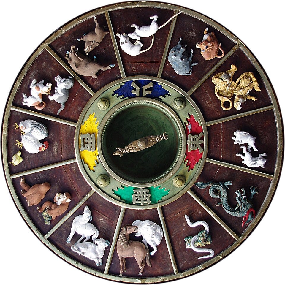
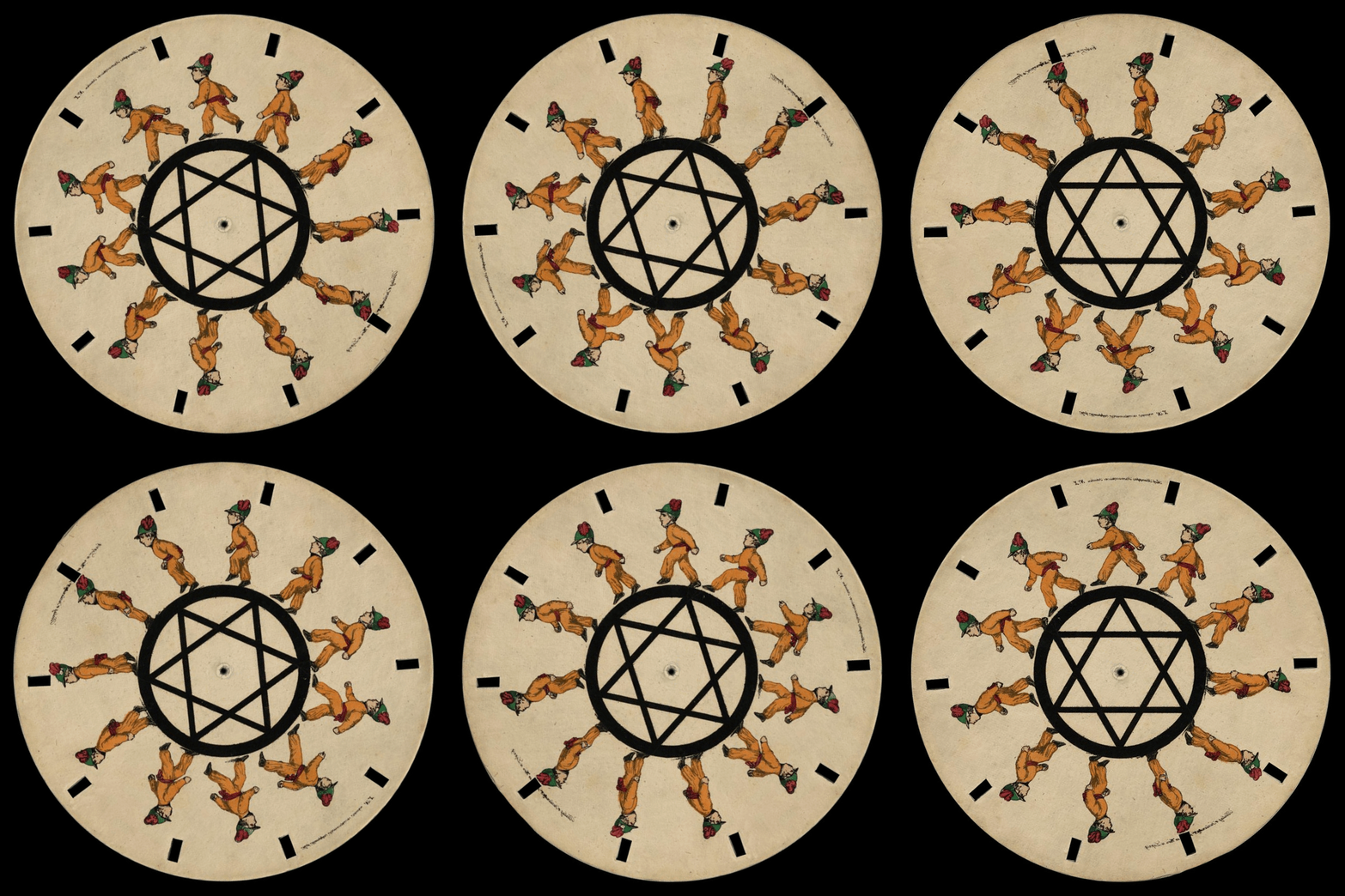

I am an avid are.na user, and I start all projects with a mood board. I have a channel I’ve been adding to for a few years called “vintage chinese ephemera” which contains images of brightly-colored disposable packaging from late 19th and early 20th-century Hong Kong and China.

For this gif’s mood board, I combined this retro decorative aesthetic with contemporary Asian candy packaging; the Rider-Waite-Smith tarot deck; the character designs of Blexbolex, a French comic artist and picture book illustrator; and, of course, vintage phenakistoscopes on Public Domain Review. Researching (or collecting, or hoarding) is always my favorite part of every creative project—I could do it endlessly! Potential outweighs production! (This, among others, is an eternal struggle.)

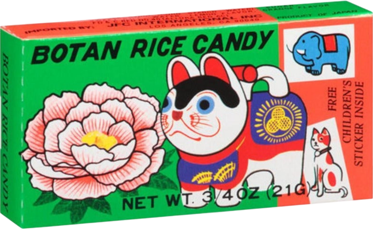
I am interested in exploring (my own) toys and childhood ephemera as containers for artistic experimentation and cultural memory. As a kid, I remember my brother and I playing with puppets of the characters from Journey to the West. They dangled from a loop, and if you pulled a string on their back, their wood limbs flailed and rattled. As brightly-colored totems, they hung from pushpins in our bedrooms—a child’s attempt at decor. My claim to this part of my heritage feels most rooted in childhood encounters with a cultural imaginary: myths and folk tales, esoteric idioms, tacit social demands, sense memories, and the intimidating scope of an ancient culture. This is something I hope to explore in my work in part with this more accessible zodiac phenakistoscope series (I do have to make this a 12-part series, don’t I?) that, on its face, takes simple delight in color, character, and the illusion of motion.
step two: rough animation
I did all my cel animation on my iPad. I knew I wanted 12 frames, so I found a few screenshots of 12-frame phenakistoscopes and sort of eyeballed the dimensions of the pie slice. I knew that the character animation needed to exist within the boundaries of the slice.
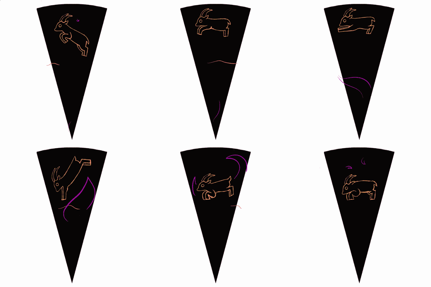
I did the sketching in Procreate Dreams because I wanted to experiment more with the program, but I did the final linework and color in regular ol’ Procreate.
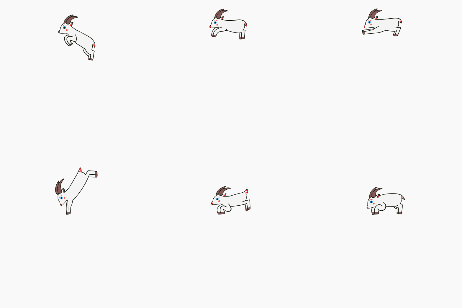
Procreate is extremely limited, but that’s not necessarily a bad thing! My last three films have been animated entirely in Procreate. Does it maybe limit my animation ability? Maybe! Do I prefer working on my iPad while sitting on the couch to working on my 2016 Cintiq while being chained to a desk? Absolutely!
step three: digital mockup
I approach most of my analog projects with a digital mockup. Part of this stems from an irrational and paralyzing fear of wasting physical materials. Another part might be that I don’t fully trust myself to be creatively spontaneous! That’s something to unpack at a later date :-)
I wasn’t entirely sure what to place in the background of the leaping goat. I struggle with making purely decorative or abstract non-narrative work, and I find symbolism to sometimes feel arbitrary or alienatingly esoteric. But I needed content. I started with the one thing I knew: I needed grass for the goat to leap from. From there, I figured I might as well add a sky. It was still looking a bit plain, so I added in some celestial symbolism to make this piece more obviously tied into the Chinese zodiac and the Lunar New Year.
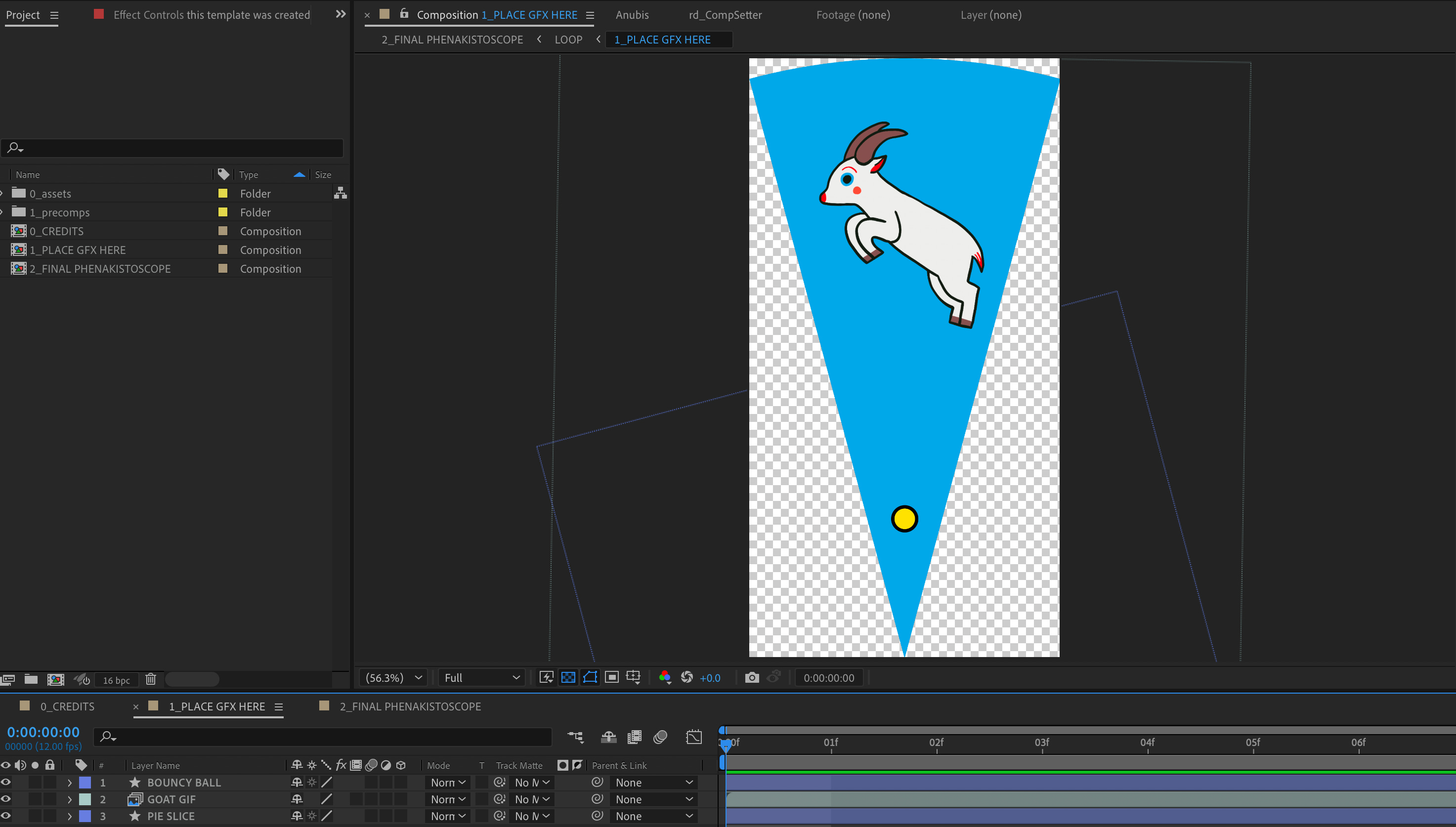
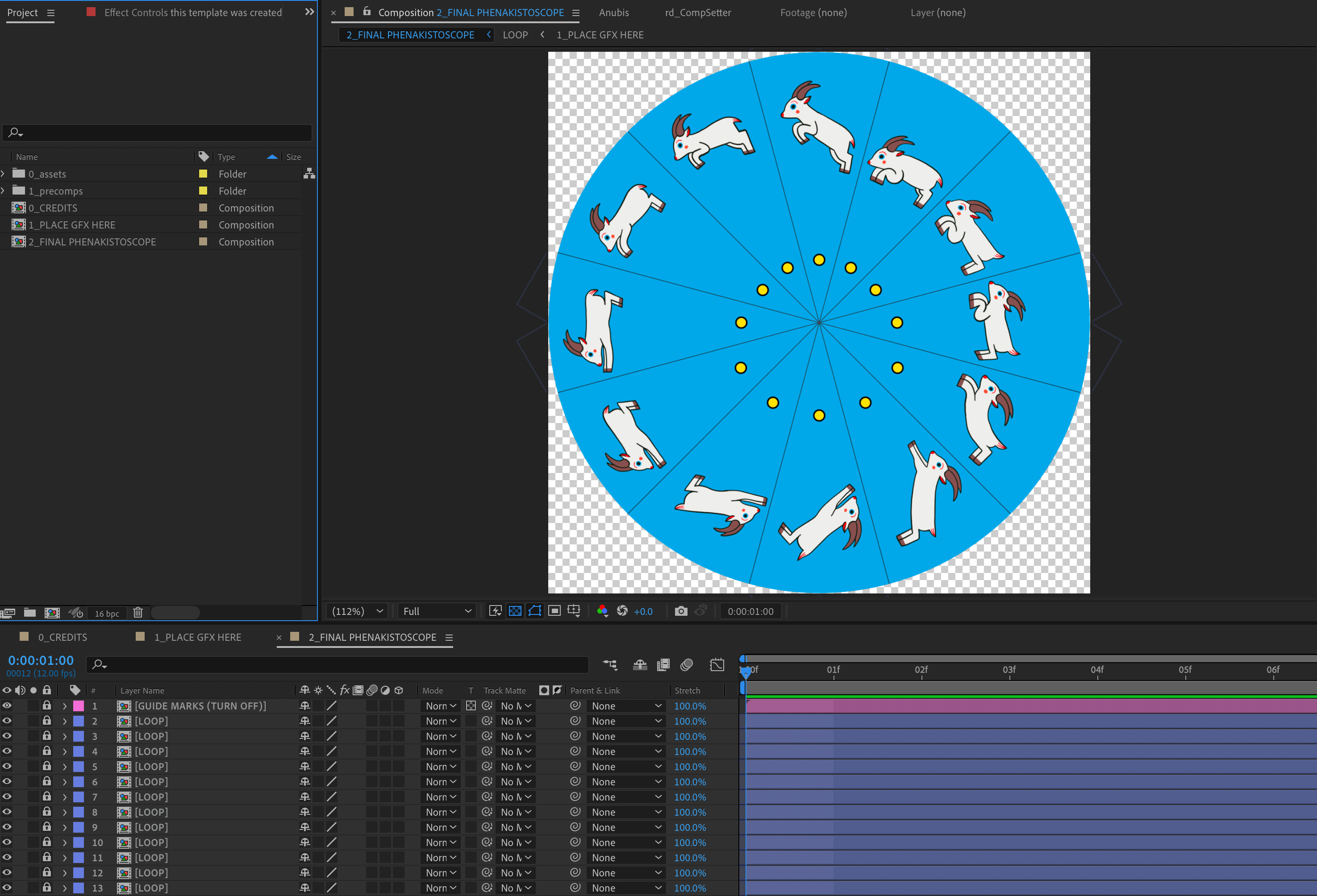
The loop is 12 frames long, and a circle is 360 degrees, so one slice is 30 degrees. I rotated each individual frame by 30 degrees to create the final, full circle!
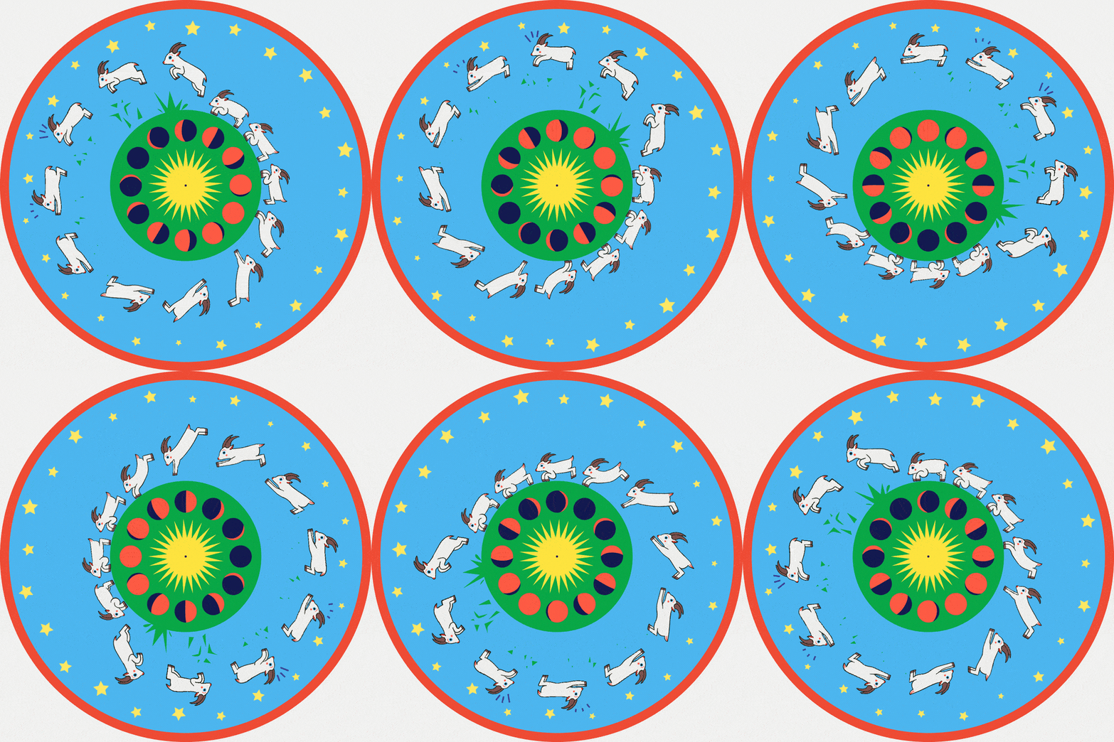
I do find mockups extremely useful when I want to make something quickly because I can more easily experiment with digital techniques. For example, I animated the grass animation by randomly making shapes with the pen tool in After Effects. I also experimented with changing the values of my original color palette to make sure each section was legible—I added a darker green outline to the green elements to better differentiate the green and blue values.
step four: trace & paint
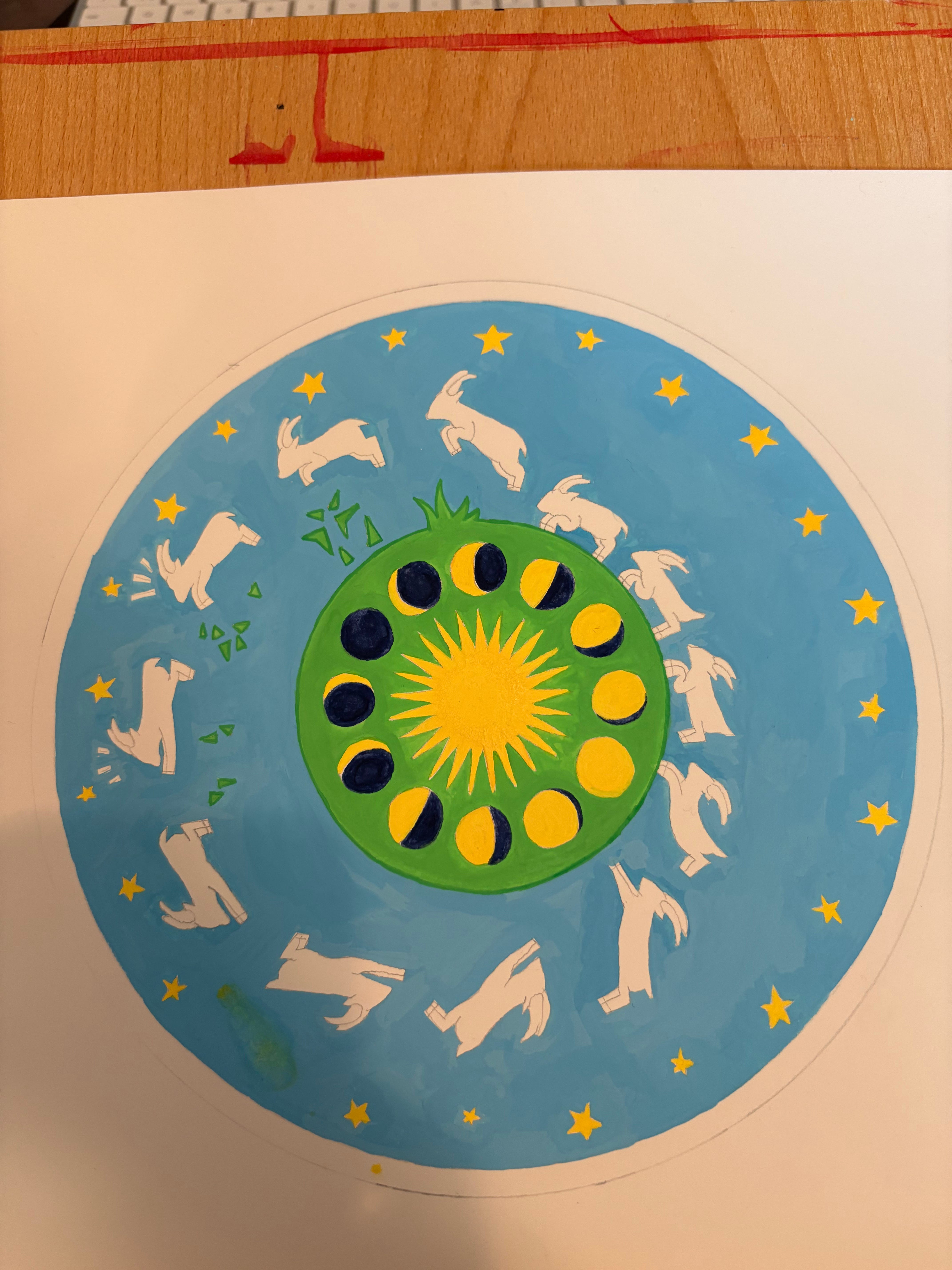
This was the easiest step! I printed and traced my digital mockup onto 9x12” Arches hot press watercolor paper. I used a drawing compass for the circle shape—this was much more accurate than freehanding the circles (and reminded me of 8th-grade geometry class). I painted with a set of Holbein Artist Gouache that I received from two separate people for Christmas (I was told to make a wishlist; I am 31 years old). I am very sorry to report that the expensive materials were a delight to work with—the gouache in particular is beautiful and opaque and has a creamy texture and is very easy to color mix.
step five: scan, composite, & export!
I lightly color-corrected my scan, and I removed the white background. I didn’t change anything else! (I may still play around with the hue and saturation—the yellow reads too sharp.)
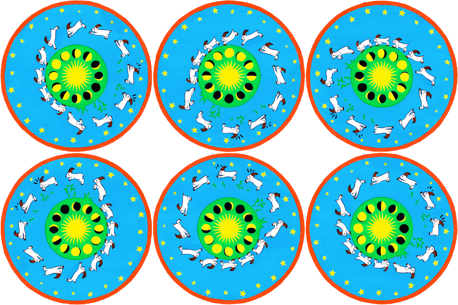
I created this by keyframing a 360-degree rotation in a one second-long comp set to 12fps. You could also do this in Premiere (or the app mentioned above!).
As promised, I’ve created a very organized After Effects template (please clap) that simplifies the slice situation. You can grab it for free below:
Thank you all for following along! Let me know if any of you have any suggestions for what else I can talk about in this newsletter! Please! I only have it in me to publish one polemic per calendar year! I’m thinking…movie reviews! Jk…unless?
🐐 Marcie
PS I am year of the dog, so that’s the next one I’ll make 🐶
really enjoyed seeing your visual references for this piece- thanks for sharing!!
Amazing to see your creative process and how you did it! Thank you so much for sharing ♥️ I really want to start to learn animation